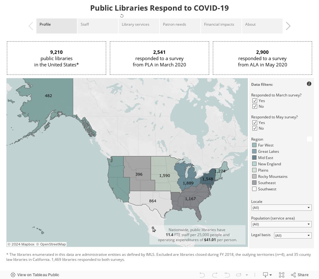
To address questions from library workers, policymakers, and the media, the Public Library Association (PLA) led a 2020 March survey and coordinated a May 2020 survey with others at the American Library Association (ALA) to understand library responses to the COVID-19 pandemic. This interactive visualization brings together public library data from both surveys. It is best viewed on a laptop/desktop.
How to use the visualization:
- This is a “story” created in Tableau Public. Use the menu under the title at the top to navigate to different “story points.” These include charts focused on staff, services, patron needs, and the financial impacts of the pandemic.
- By default, the map shows all US public libraries. Explore their characteristics as a whole (from IMLS Public Library Survey data in FY2018), or use the filters to select only those who responded to the surveys or only libraries of a certain type.
- The same filters—locale, population, region, and legal basis—can be applied to the other charts in the story. For example, if you work in a rural library, you could select only rural in the locale filter and see data from other libraries like yours.
- Hover your mouse over any part of a chart and you’ll see a “tooltip” with detailed information about that data point.
- All data is aggregated so no library is individually identified. See the “about” story point for more background information on the data.
Download summary tables of the survey data contained in this visualization.
Created by Sara Goek, Program Manager, PLA.